
Machinery Row Bicycles
Rebranding
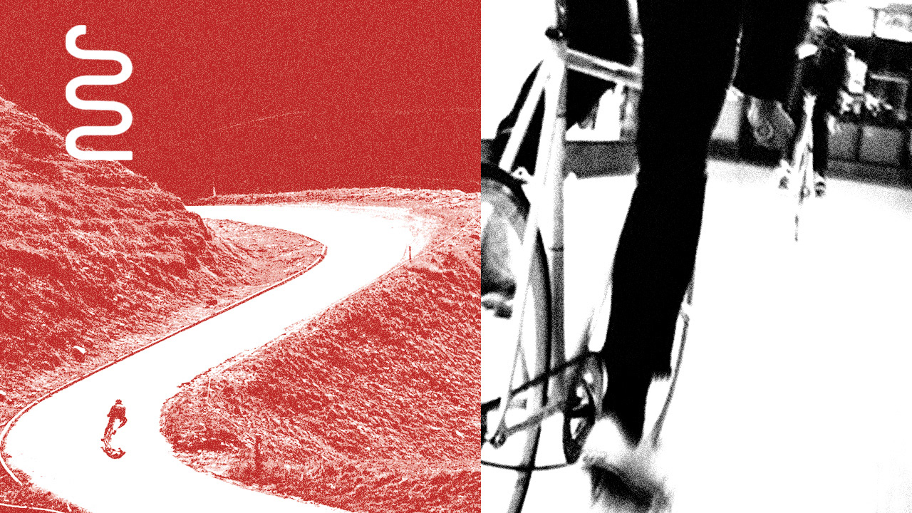
For this project, I was asked to develop a unique and cohesive visual identity for a chosen brand or event. The goal was to establish a distinct, memorable style through original illustrations, photography, and typography. After selecting Machinery Row Bicycles, I chose to delve into a skate aesthetic with grainy image treatment in order to capture the grudge aesthetic of their location.
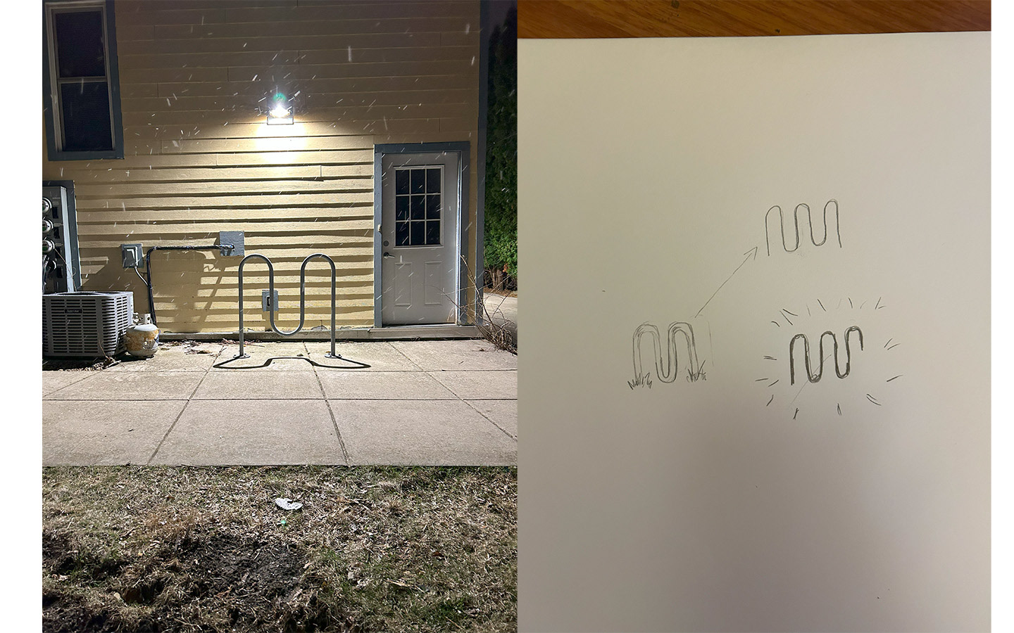
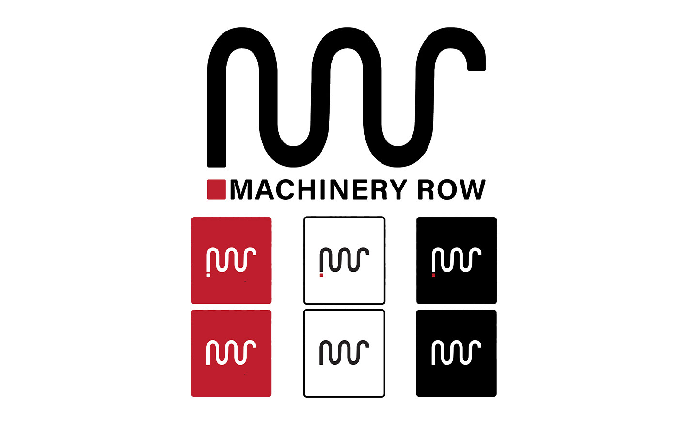
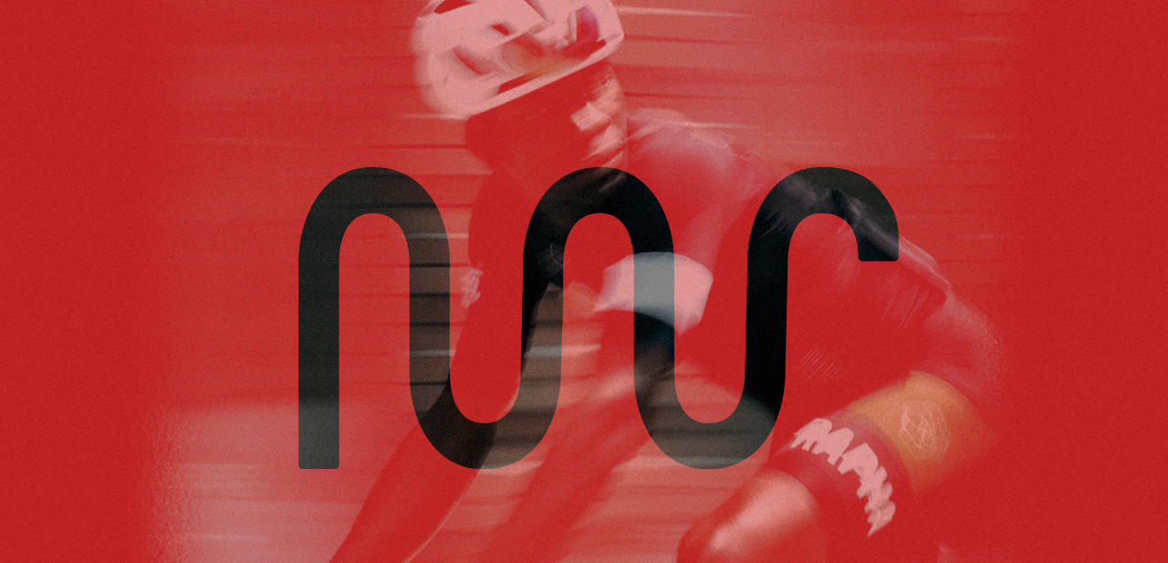
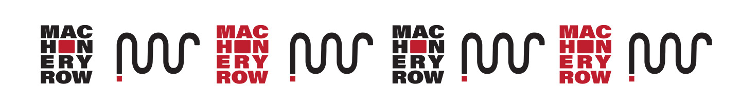
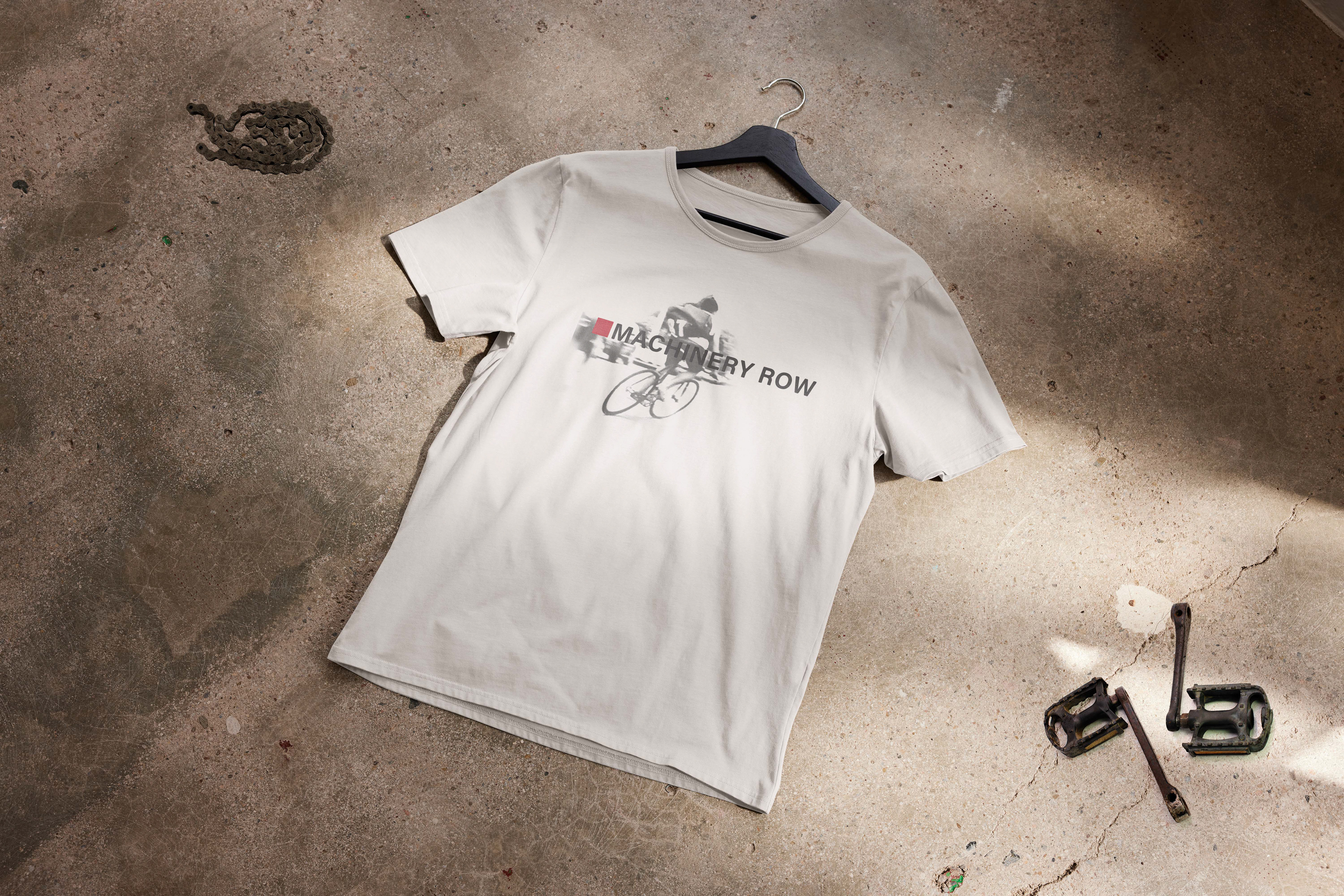
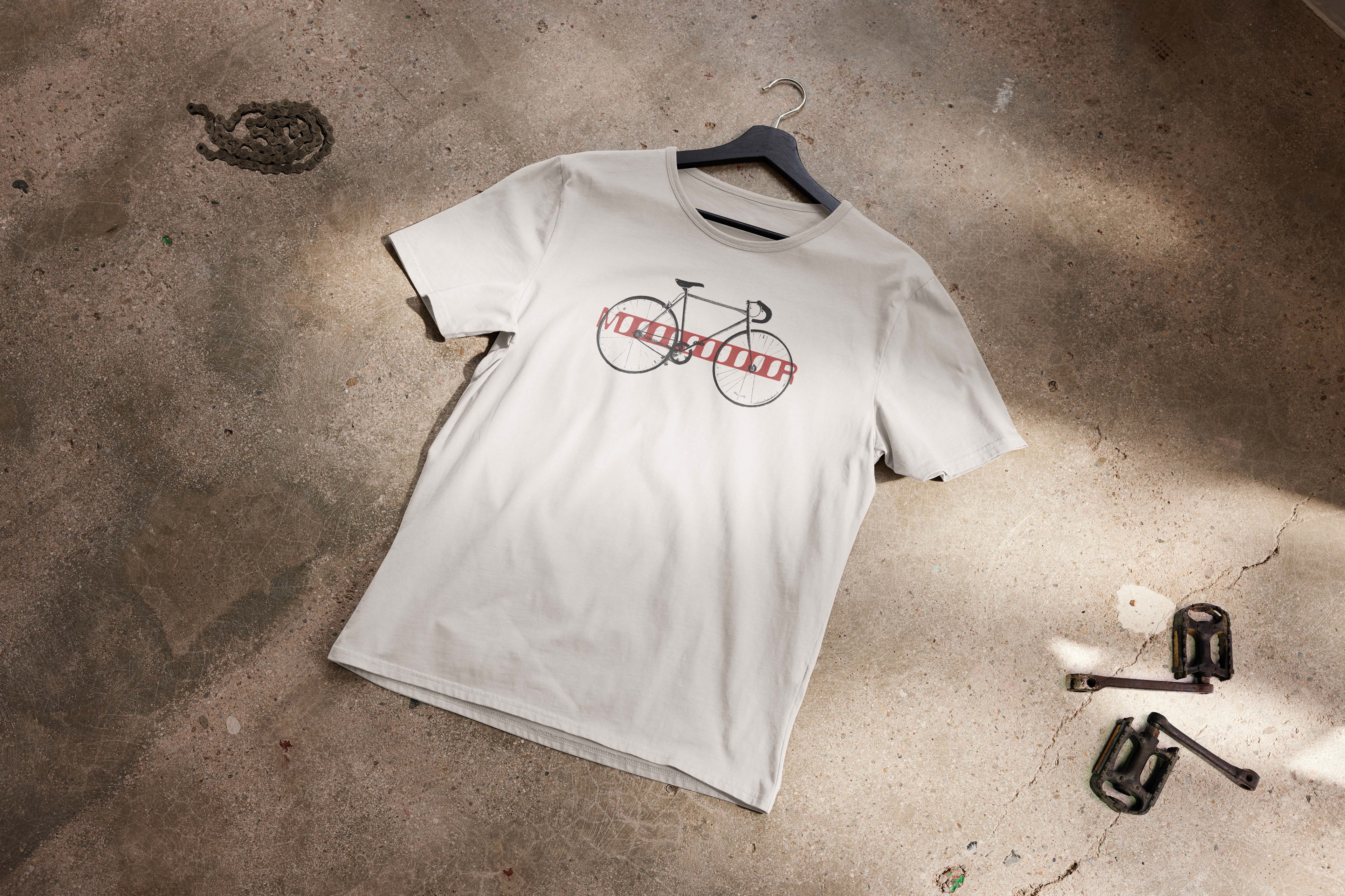
I created a new logo, inspired by the curves of a bike rack outside my apartment, to form an M and R. Knowing their close relationship with the community, I created a versatile logo that provides Machinery Row Bicycles with a solid, contemporary visual image for their branding. I revised their existing branding and visuals to combine structural and modern aesthetics.
I created a new logo, inspired by the curves of a bike rack outside my apartment, to form an M and R. Knowing their close relationship with the community, I created a versatile logo that provides Machinery Row Bicycles with a solid, contemporary visual image for their branding. I revised their existing branding and visuals to combine structural and modern aesthetics.
Brochure
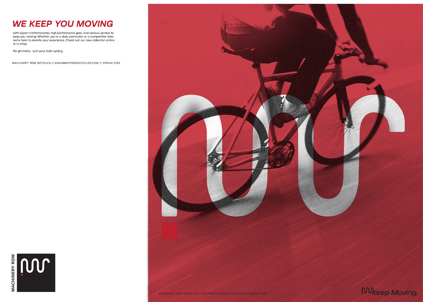
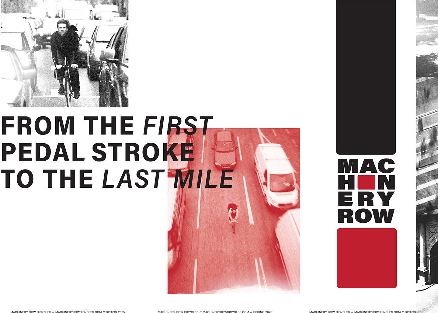
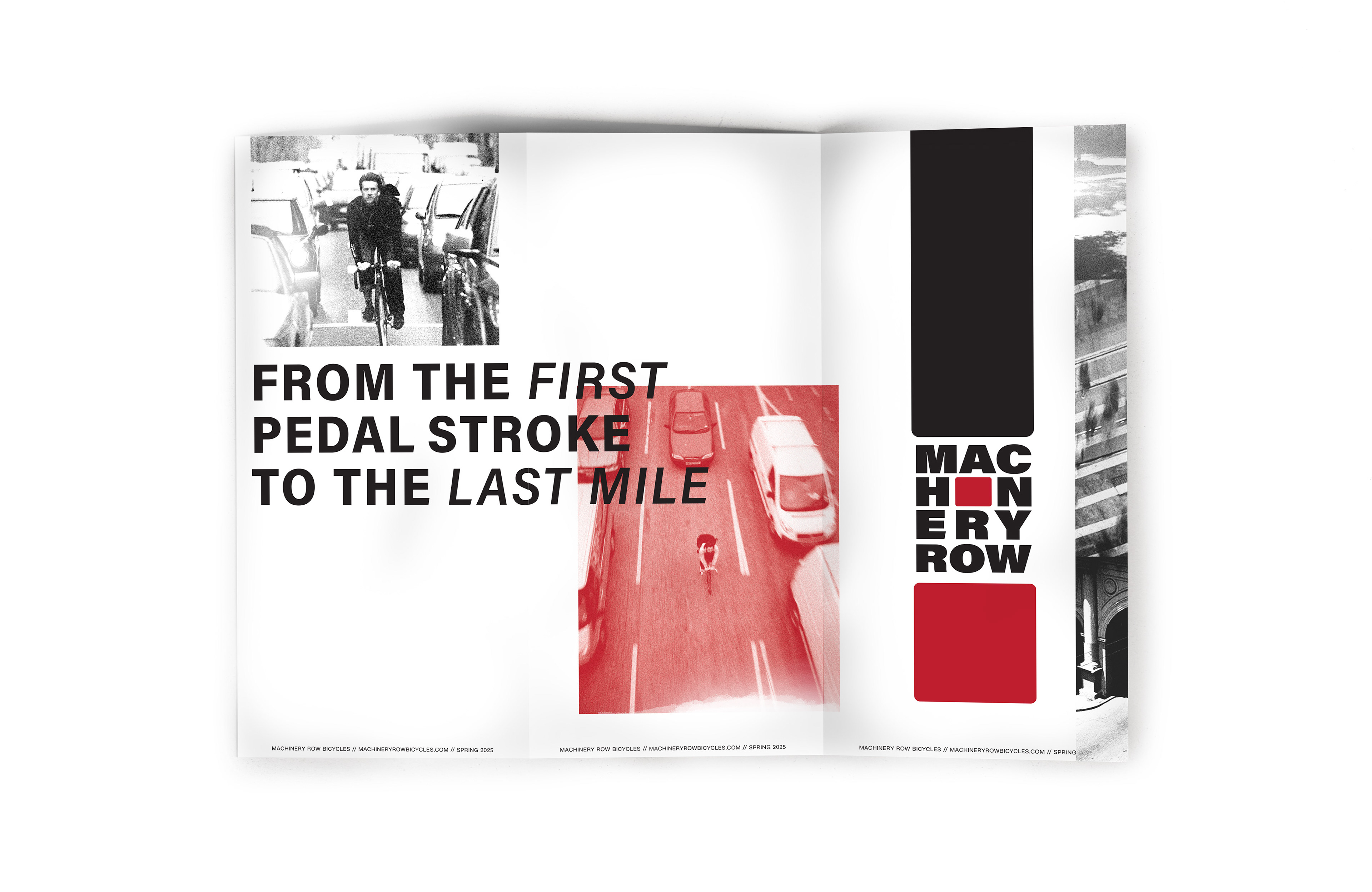
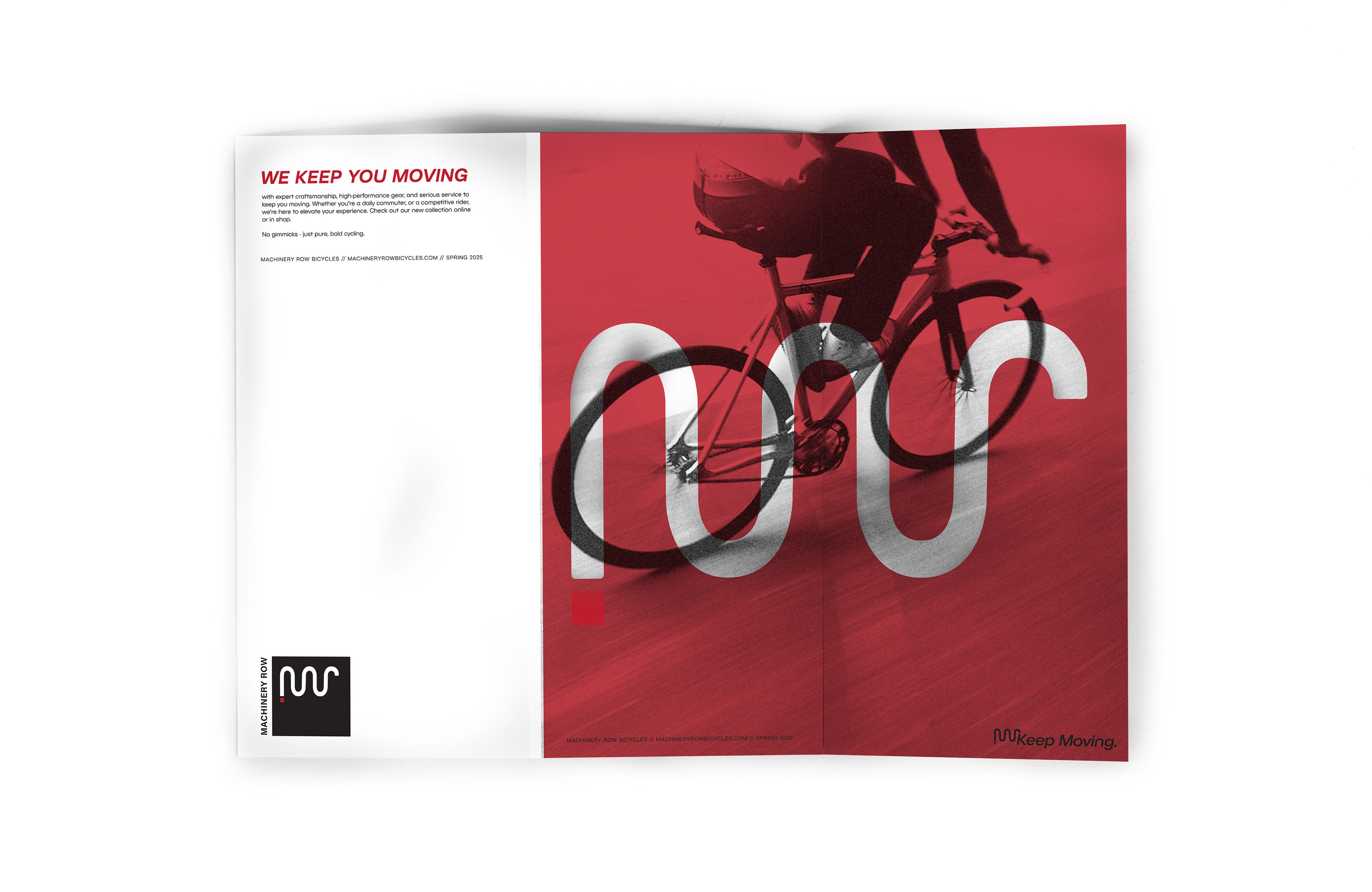
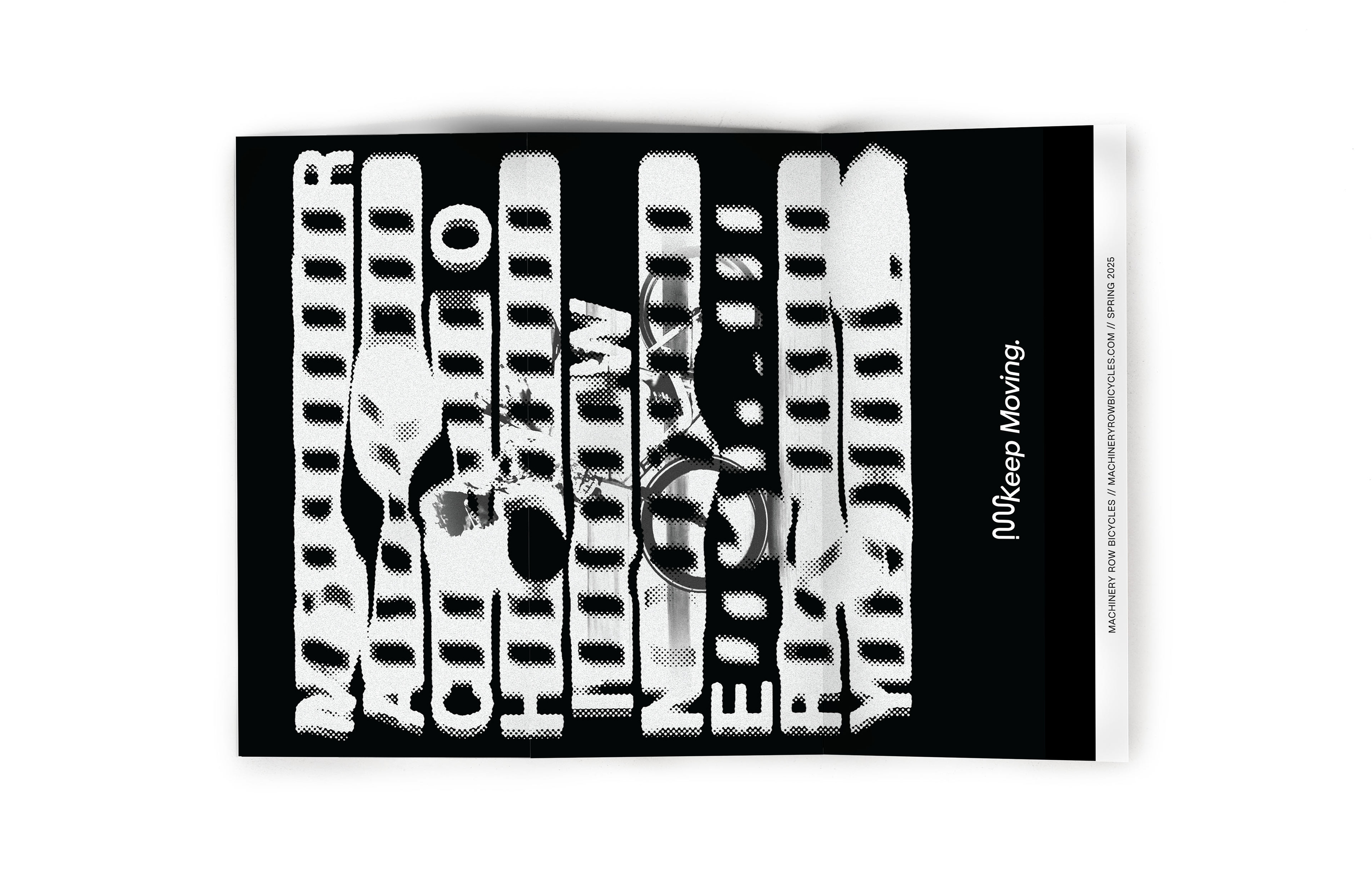
The brochure serves as more of an invitation to the brand, not directly pointing out products but highlighting the energy and attitude of Machinery Row.
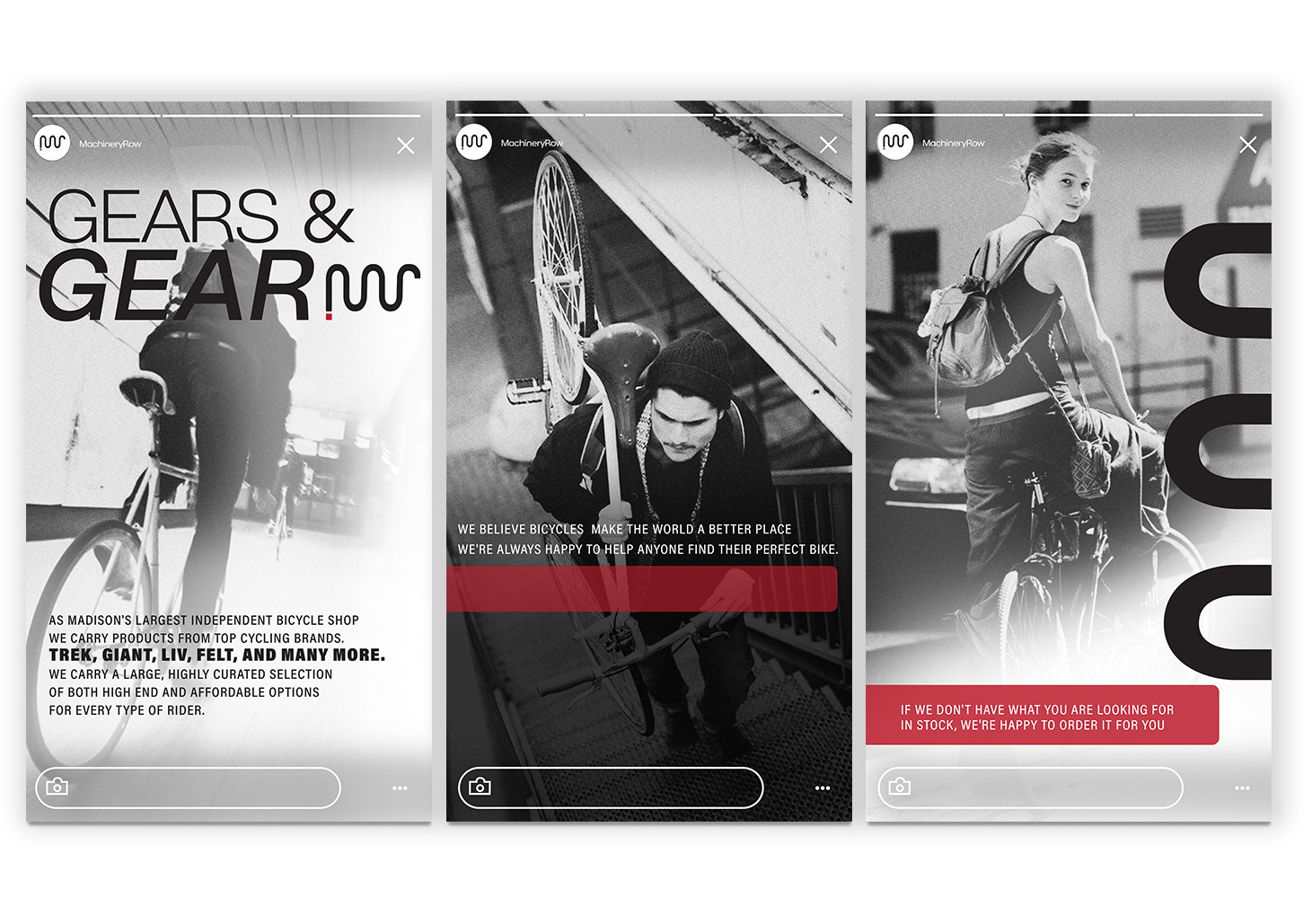
Social Story

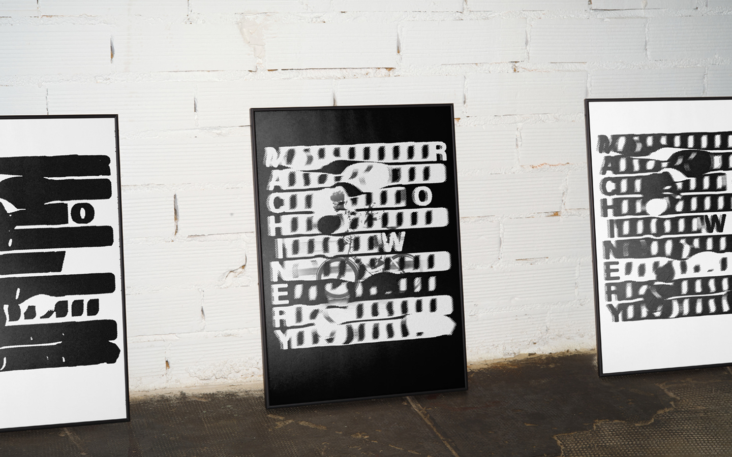
Posters | Store Decor
Process
Machinery Row Bicycles is a local bike shop based in Madison, Wisconsin. Renovated from a historic distributing warehouse, the shop embraces brick architecture and factory aesthetics. Because of this historic space, their shop remains committed to the local bike community, one that Madison is well-known for.
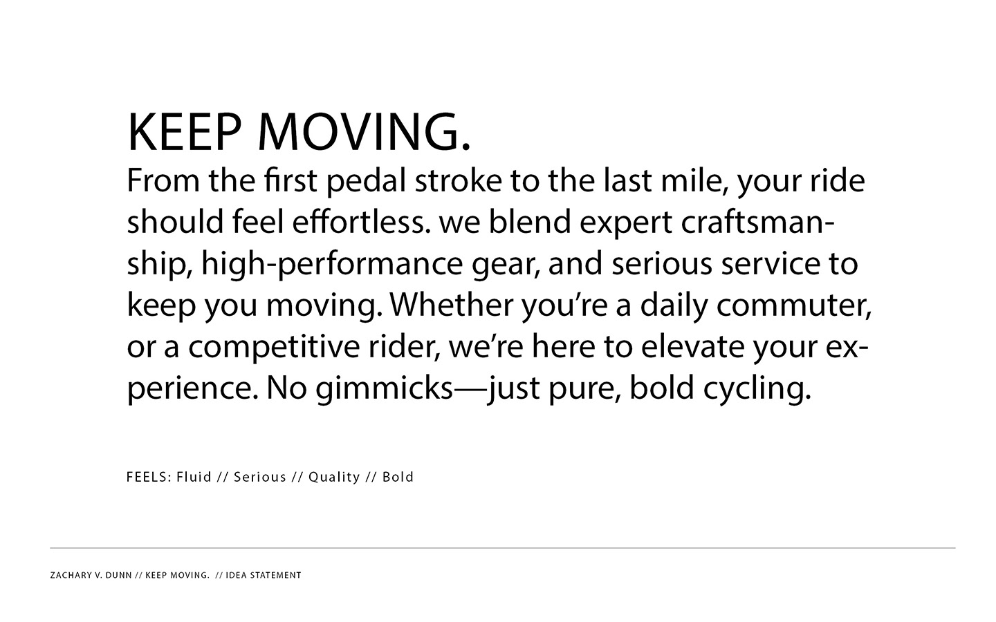
Idea statement
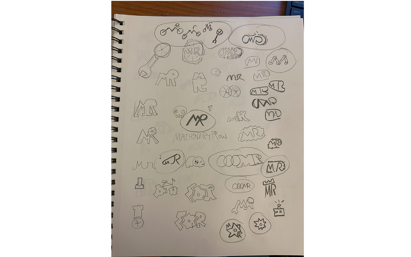
Sketches
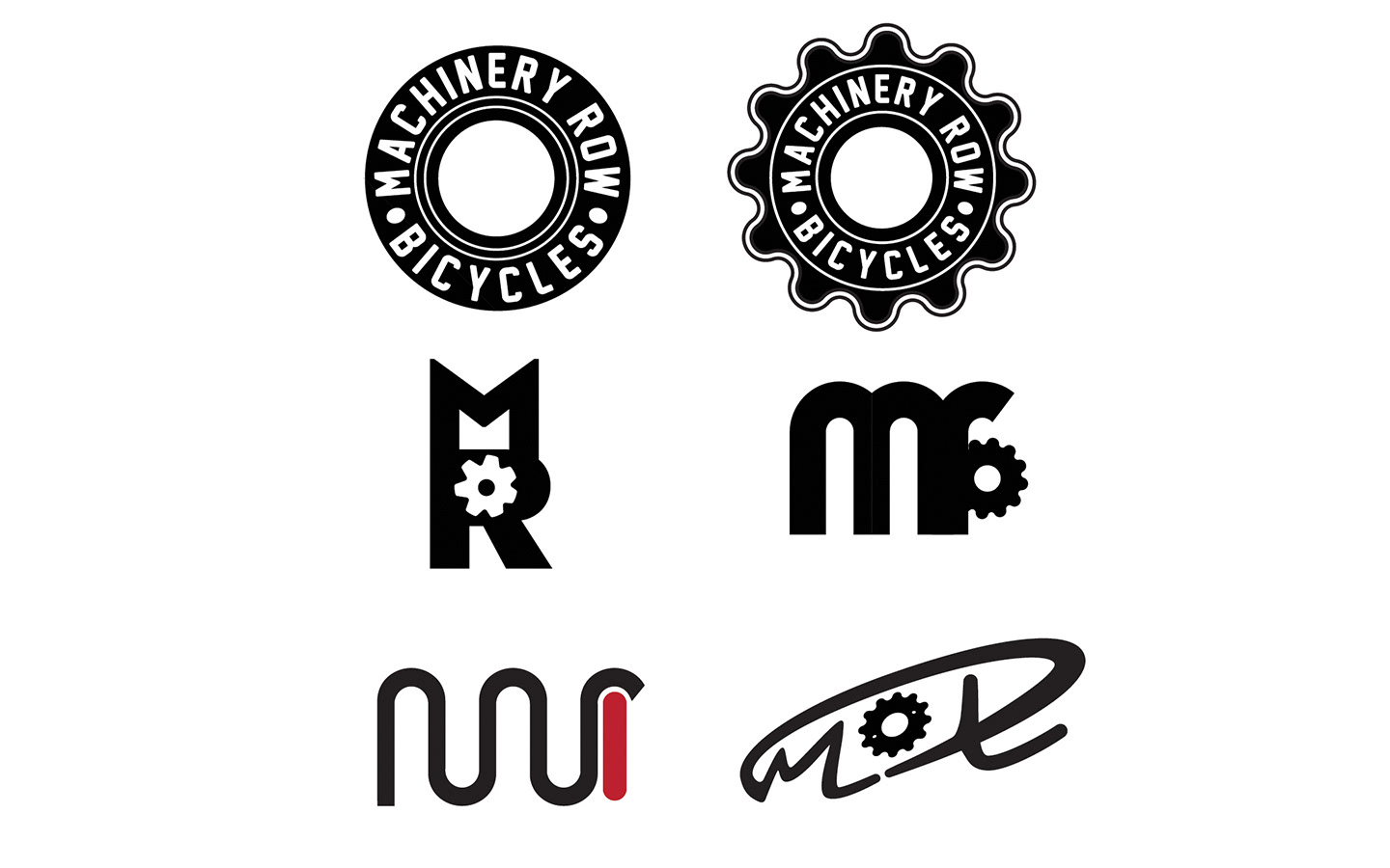
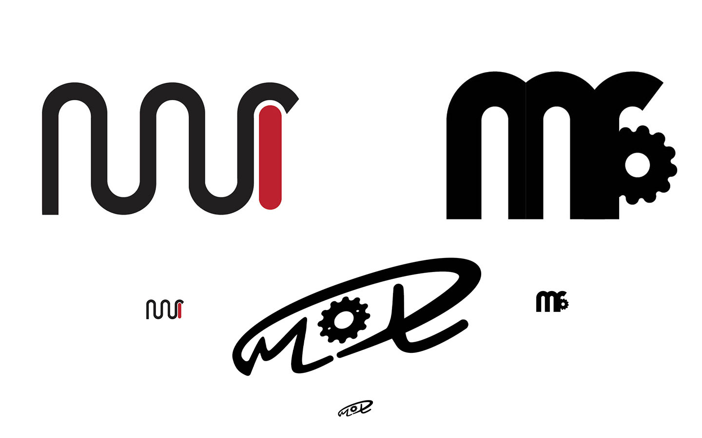
Early logo's